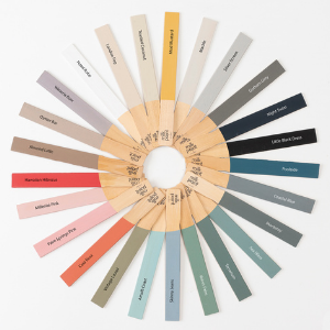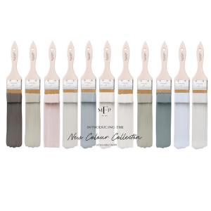
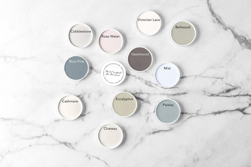
11 New Fusion Paint colours
Fusion has just launched 11 new colours to add to their permanent collection! I have had a chance to have a sneak peek at these and I may have got my hands on some 😉 .. They are stunning! and I know you are going to love them, so without further ado let’s have a look at them.
11 new colours
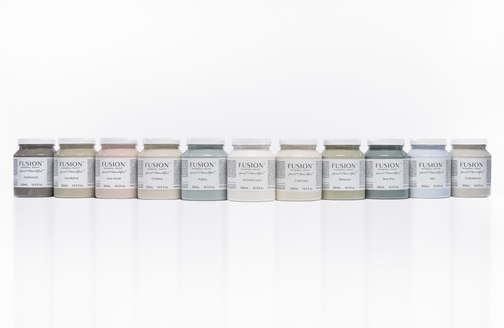
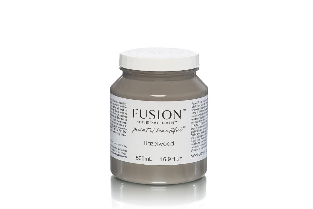
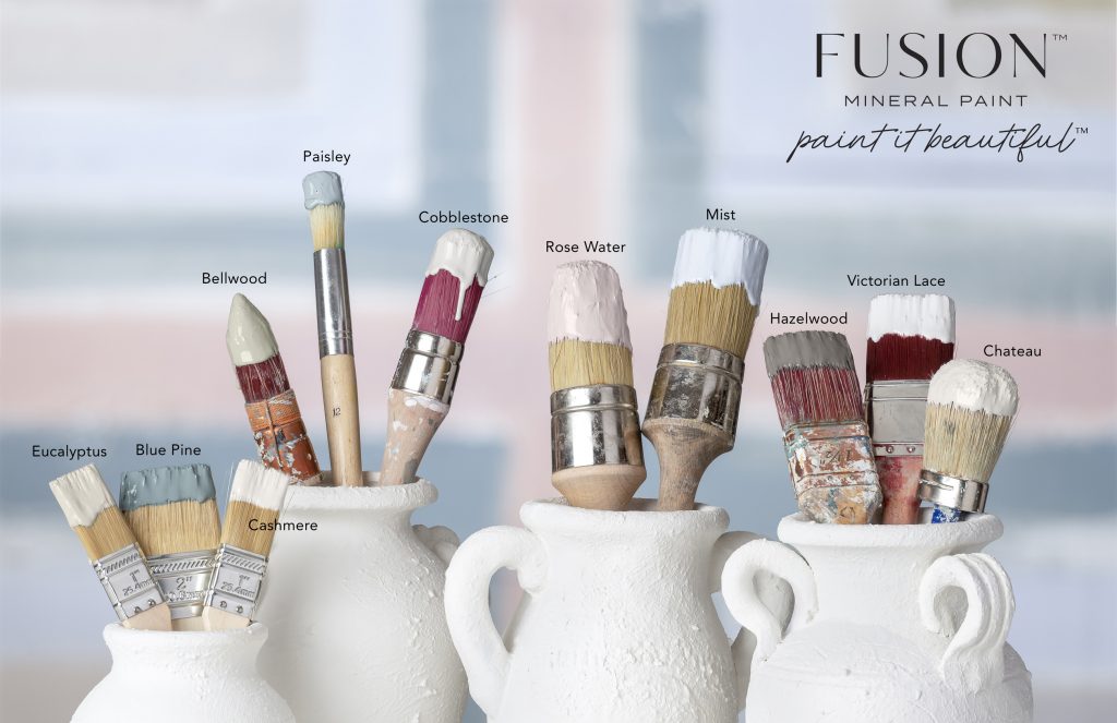
HAZELWOOD
This deep grey feels both warm and grounding. Use it to create dimension as an accent or to make a dramatic statement.
Pair with:
Cashmere for a neutral look Rose Water for a feminine flair
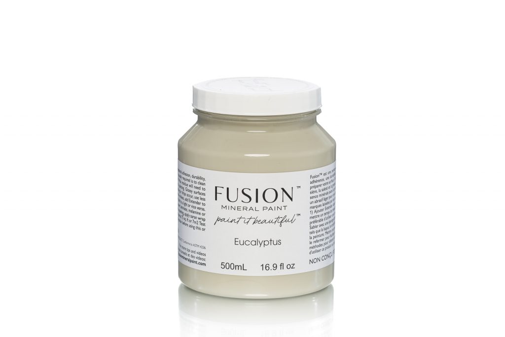
EUCALYPTUS
A muted green with undertones of grey, this shade is calming and serene.
Pair with:
Raw Silk for a calm, serene space Lamp White for a perfect neutral pairing with depth
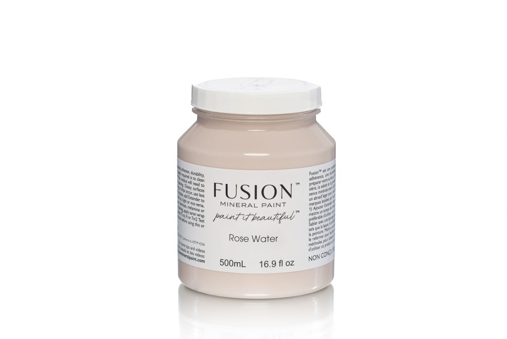
ROSE WATER
A neutral pink inspired by the droplets from steeped rose petals. Delicate and modern, this shade is stylish in any space.
Pair with:
Cobblestone for a timeless feel Victorian Lace for a purely glamorous look
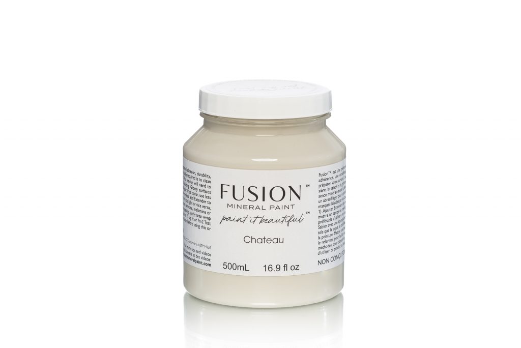
CHATEAU
A grounding neutral inspired by enchanting castle walls. This shade reflects light beautifully and creates an instant feeling of cozy sophistication.
Pair with:
Blue Pine for a feeling of whimsy Algonquin for a warm, natural palette
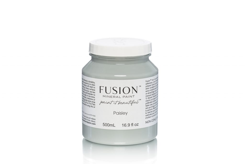
PAISLEY
An ode to our heritage. Inspired by the rivers edge that runs through the beautiful town of Paisley, Scotland; this multitone blue evokes a whimsical feeling.
Pair with:
Little Whale for a neutral tone-on-tone backdrop Rose Water for a charming twist
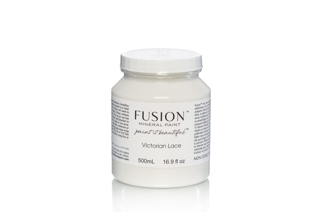
VICTORIAN LACE
Romantic in every way, this multitone white is perfectly balanced between warm and cool. This shade is inspired by the intricate details of its namesake.
Pair with:
Little Lamb for a chic tone-on-tone look Inglenook for added depth
CASHMERE
Wrap up in the warmth of this luxurious neutral. Soft and elegant, this shade offers a slight cream undertone.
Pair with:
Paisley for an unexpected sense of playfulness Damask for a luxe look

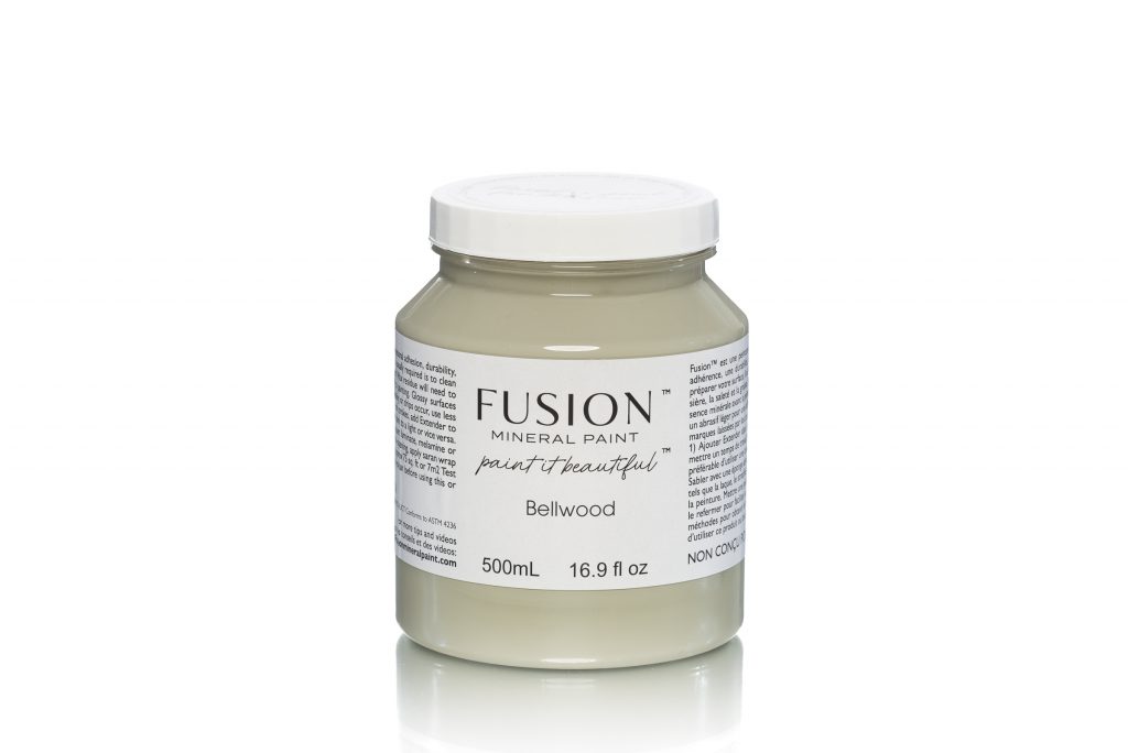
BELLWOOD
A timeless green with a lush feel. This versatile sage-inspired shade works beautifully with both classic and modern decor.
Pair with:
Plaster for a classic feel Cathedral Taupe for a warm, earthy look
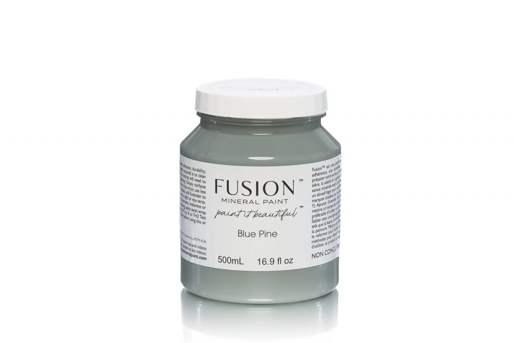
BLUE PINE
This versatile blue-green has a grey tint, making it the perfect choice to make a bold statement on its own or as a neutral foundation within any room.
Pair with:
Victorian Lace for a warm, relaxed look Fort York Red for a pop of contrast
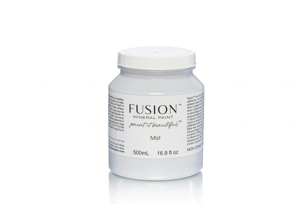
MIST
Playful and charming, this periwinkle brings a cheerful pop of colour to any room.
Pair with:
Casement for a refined yet effortless look Lamp White for added sophistication
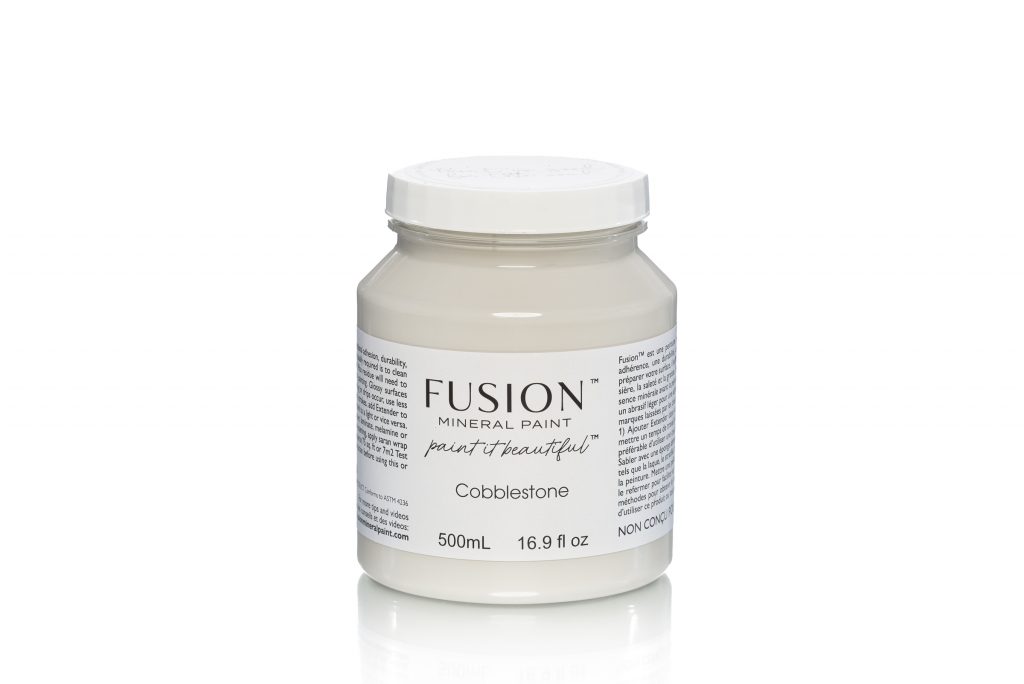
COBBLESTONE
This warm grey is inspired by winding cobblestone roads – equal parts romantic and sophisticated.
Pair with:
Bedford for a truly traditional look Homestead Blue to bring a laid back vibe
Beautiful shades
Fusion already has beautiful colours and these just round out the collection. There are a few in there that will be firm favourites but they all fill a gap in the colour palette.
Which one do you want to try first?
It is almost impossible to choose!
These will be available in the UK in August so stay tuned.